
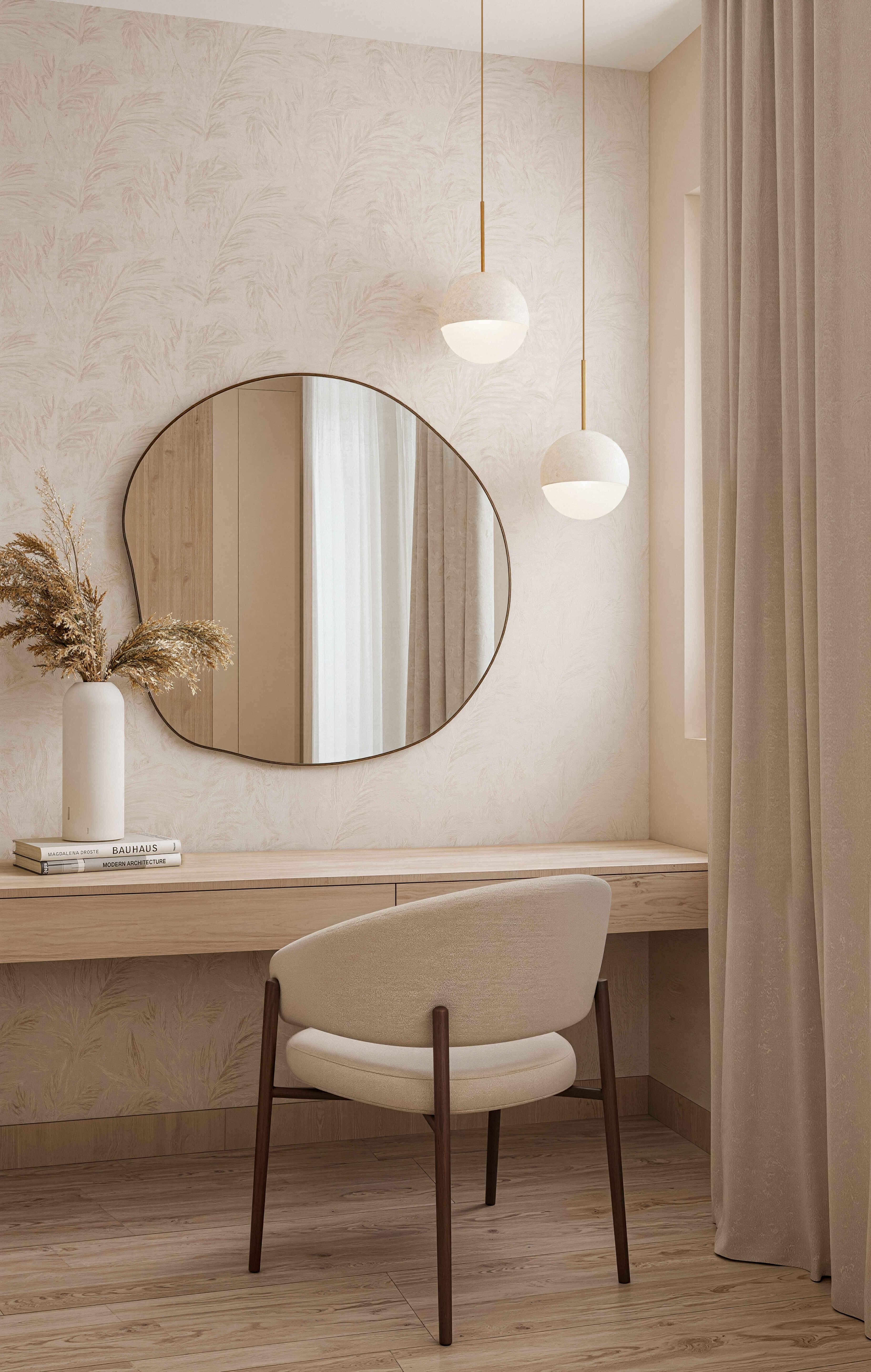
How we translated a warm-minimalist family home into a visualization that communicates calm, tactile materials and soft, considered light.
The brief for the Sleek Modern Residence in Sydney arrived with a clear directive: the client wanted the images to feel calm and lived-in, not showroom-perfect. The design — soft earth-toned walls, oak cabinetry, bouclé upholstery and brushed brass — was already doing the work. Our job was to let it read as a home, not a catalogue.
We began, as always, with the light. Rather than the hard, high-contrast light typical of exterior work, this project called for something softer — daylight filtered through sheer linen curtains, pooling low across the timber floors. We modeled a late-morning sun position that let the light wrap the open kitchen-living space without ever overexposing the pale walls.
Material accuracy was the second discipline. Warm-toned interiors like this one live or die on subtlety: the grain direction of the oak veneer, the slight nap variation across the bouclé chairs, the way brushed brass picks up ambient light differently than polished metal. We spent considerable time calibrating these details room by room — the dressing nook, the bedroom's fluted headboard wall, the kitchen island's stone edge.
The final challenge was styling. A residence like this reads as either curated or staged, and there's a fine line between them. We built a set-dressing palette that felt collected rather than arranged: dried pampas in a plain vase, a small stack of design books, a single olive branch on the coffee table — small, specific choices that make a room feel occupied rather than photographed.
The result is a set of images that read as a home someone actually lives in — quiet, tactile, unshowy. The client used them to present the interior concept to their design consultant, and internally to sign off the final furniture and material selections before ordering.
View the project
Open project →